Tom Larkworthy 2025-06-30 06:05:56 Been working on trying to help the reader understand the computational graph a bit more. Also trying to improve the UX a bit. Now the dependancies are show under each cell, but the edit menu has to be enabled first so its less annoying if you are jsut reading. Clicking the links take you to the cell. Thanks Konrad Hinsen for the push 🙂 . WIP coz it does not link across module imports yet, or built in functions.
Tom Larkworthy 2025-07-02 07:03:39 Trying to help map the cell structure of a reactive runtime. WIP this is overwhelming but it looks pretty. The clumps are modules. The concentrated rainbow arc is pointing at the stdlib. It does communicate the intense collaberation inside a module and the sparse connections between modules though.
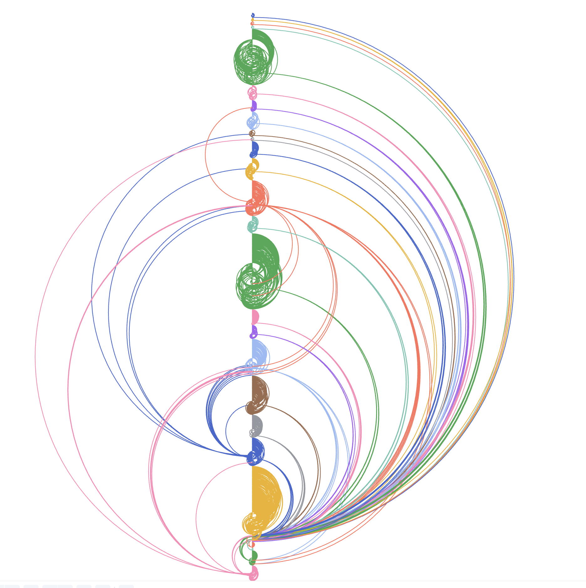
Tom Larkworthy 2025-07-03 20:11:46 So I got somewhat mesmerised by this and it doesn't explain the variable <-> cell relation at all, but it looked too magical not to use. So now its a fancy index. Clicking will open the cell under the mouse. Coloring the modules has worked well, I would like to extend the color codes to the module tabs as well to help correlate the concept that a tab is a module, but I can't fall too deep into this hole just yet. I need a graphic to explain cells and this ain't it.
Tom Larkworthy 2025-07-05 18:21:42 ok so this I think is closer to at least depicting that some reactive variables are bundled (the fat lines). Its a closeup of the earlier chart. The variable on the left has all its dependancies unrolled. Reminds me of the tube map. Every dot is a hyperlink that takes you to the cell.
I keep hearing transclusion in the literature, I thought I wasn't really doing transclusion because they are real links, but because the links don't navigate the top view I guess they are transclusion actually.
Paul Tarvydas 2025-07-06 08:08:04 If you care to spend time further expanding on this, I need more hand-holding. There are 4 shapes - circles, squares, triangles, plus signs. There are 3 kinds of lines - solid, dashed, fat. There are several colours - orange, blue, green, red. And there's black text. My knee-jerk reaction is that each of these has a separate meaning, which I don't grok yet.
Tom Larkworthy 2025-07-06 08:16:29 I am so glad you said that! The main point of this visualization is to provoke the reader into noticing a knowledge gap of the programming model. Those cells are clickable, so without that interaction part you can't close that gap autonomously.
The interactive notebook is now published here observablehq.com/@tomlarkworthy/cell-map
Still, it would take a fair amount of detective work to solve it still. The programming model is written here. "Cells can be views" and "Cells can be mutables" are relevant to the symbols. The square ones are imports, you can see the cell colors change when bridging via a square. The circles are simple dataflow cells which is probably the first thing you would implement if designing a dataflow language, they are just functions (actually they can also be generators, probably that should be reflected in the symbology too as they act quite different).
📝 cellMap
computes the mapping of reactive variables to higher level notebook cells, grouped by module cellMap cellMap function You can call it with zero args to default to the current runtime, or pass in a subset of variables to extract the cell structure from just those. Visualizations visualize the cell ordering testing low-level variables in this module Utilities
📝 Observable JavaScript | Observable documentation
Everything you need to build the best data apps.
Tom Larkworthy 2025-07-06 08:17:04 [July 6th, 2025 1:08 AM] tom.larkworthy: Finished my live, navigable and interactive visualization of the Observable runtime graph. Works on both Observable and Lopecode.
• live: if you add/remove a cell the visualisation update.
• navigable: if you click a cell you are taken to the cell source (on observable this opens a new tab and scrolls to the cell)
• interactive: as you scroll though birds eye view the detailed visualization expands the dependancies of the focused cell. You can click to pin the current cell.
The overall point of this notebook is to provoke the reader into understanding the programming model and ask questions like "what is a viewof" when they try to understand the dependancy graph. Its also useful for authors to find stray dependancies and plan refactors on complex notebook networks.
https://observablehq.com/@tomlarkworthy/cell-map
