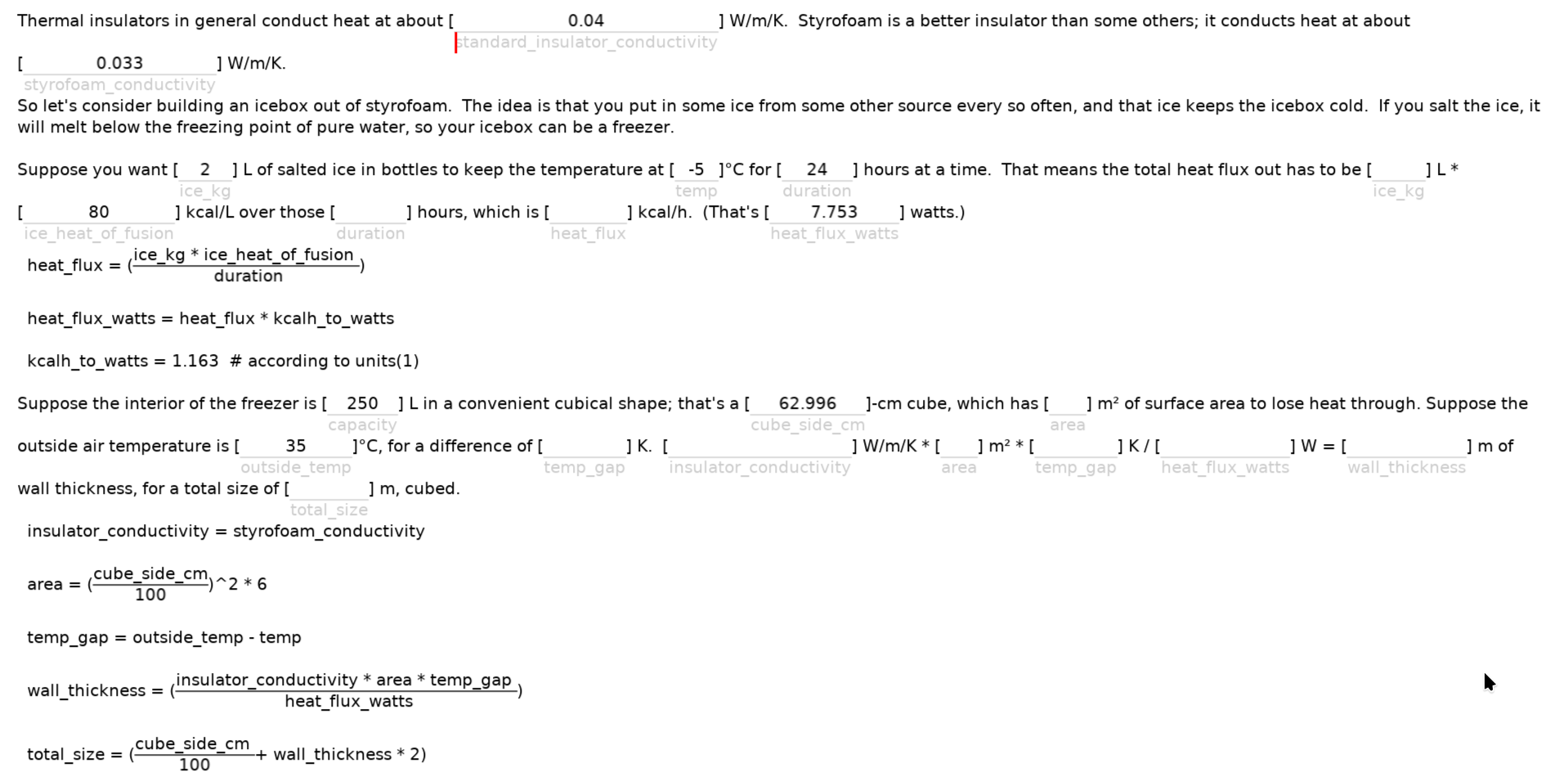
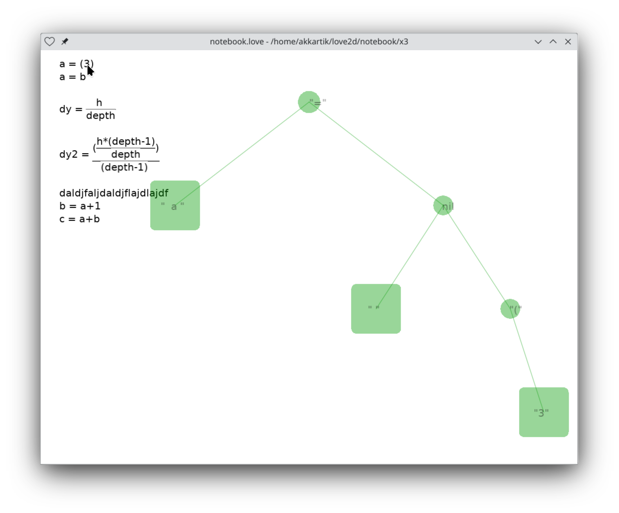
The current Obsidian editor does something like that, too.
As a user, when writing a long essay, I occasionally find this behaviour disconcerting - the appearance on the screen changes so dramatically that it is disconcerting. I feel "not in control".
The older Obsidian editor had two modes (1) writing and (2) reading. That felt clumsy. I guess that I could enable that behaviour with some option, but, I never do.
Emacs md-mode shows a hint of the styling, e.g. _abc_ is displayed with abc italicized but leaving the underscores visible and taking up space that doesn't appear in the final rendering in a browser.
Traditional WYSIWYG editors like Microsoft Word and Apple Pages make formatting characters invisible, but, show formatting details in a property box off to the side (where you're not looking) while binding formatting operations to certain keystrokes, e.g. command-I for italic.
PlantUML uses two side-by-side Siamese Twin windows - a writing window and a preview window. Our "Slider" app in the Handmade Jam (last year?) did that (two windows), too.
A freebie "user-friendly" LaTeX editor (LyX) tries to straddle both views at once - like the new Obsidian editor - but, I find myself not using it.
Thus far, as a user, I find all of the above choices evil. I tend to favour WYSIWYG, but, wonder if the two-window approach would be better if the tool made the windows entirely separate instead of being bolted together.
I find translucency intriguing (futureofcoding.slack.com/archives/C5T9GPWFL/p1726773202938769), but haven't used a word processing editor that contains it.
Currently, I use the lesser of two evils. I switched from using Obsidian (out-of-human-control formatting) to using Pages (WYSIWYG with a property box at the side). My frequency of swearing hasn't decreased, but the target of swearing has moved.

